SeniorCircle
An accessibility-first events app concept to help socially isolated seniors discover age-appropriate activities, book tickets, and stay connected to community.
Interface walkthrough
A short walkthrough showing onboarding, event discovery, accessibility tools, and booking.
Problem
Many senior citizens face social isolation and a lack of accessible platforms that cater specifically to their interests and needs. Existing event discovery and booking applications are often not designed with seniors in mind, making them hard to navigate and irrelevant in content—creating barriers to social engagement, physical activity, and overall well-being.
Tools used
- Figma
- ProtoPie
- FigJam
My role
- UI designer + wireframing
- Product design user research
- Survey creation + synthesis
- Flow mapping and usability testing support
Core flows
- Login / Sign up with profile setup
- Event discovery with search + filter/sort
- Event details → ticket purchase
- View bookings (past / upcoming)
- Accessibility tools (text size + contrast)
Overview
SeniorCircle is an accessibility-first event discovery platform designed specifically for seniors aged 75+. Unlike generic event apps, the interface prioritizes large typography, simplified navigation, and reduced cognitive load.
Personalized recommendations consider age-appropriate interests and proximity, while a “known attendees” feature encourages social confidence. The app also allows users to view past activities, manage future bookings, and stay socially active—reinforcing independence and community belonging.
Target audience
- Elderly individuals aged 75+ seeking community connection
- Post-retirees looking for structured activities
- Individuals living alone or new to a neighbourhood
- Users with varying levels of technical comfort
What makes it different
- Accessibility defaults (large touch targets, readable hierarchy)
- Known-attendees event suggestions to reduce social anxiety
- Messaging to foster community before/after events
- Past activities + future bookings in one simple system
Outcome
The prototype showcased a user-centered platform tailored to seniors seeking personalized event experiences. Built in Figma and ProtoPie, it received highly positive feedback for its intuitive interface and relevance—validating the design direction and demonstrating strong real-world potential.
End-to-end journey
The experience was designed as a predictable, low-friction sequence:
- Launch → Sign up / Login
- Profile setup → Interest selection (max 3)
- Home → Search / Filter events
- Event details → Booking → Confirmation
- Profile → Community connection + messaging
Key decisions: linear onboarding, visible “Next” progression, and persistent bottom navigation to prevent disorientation.
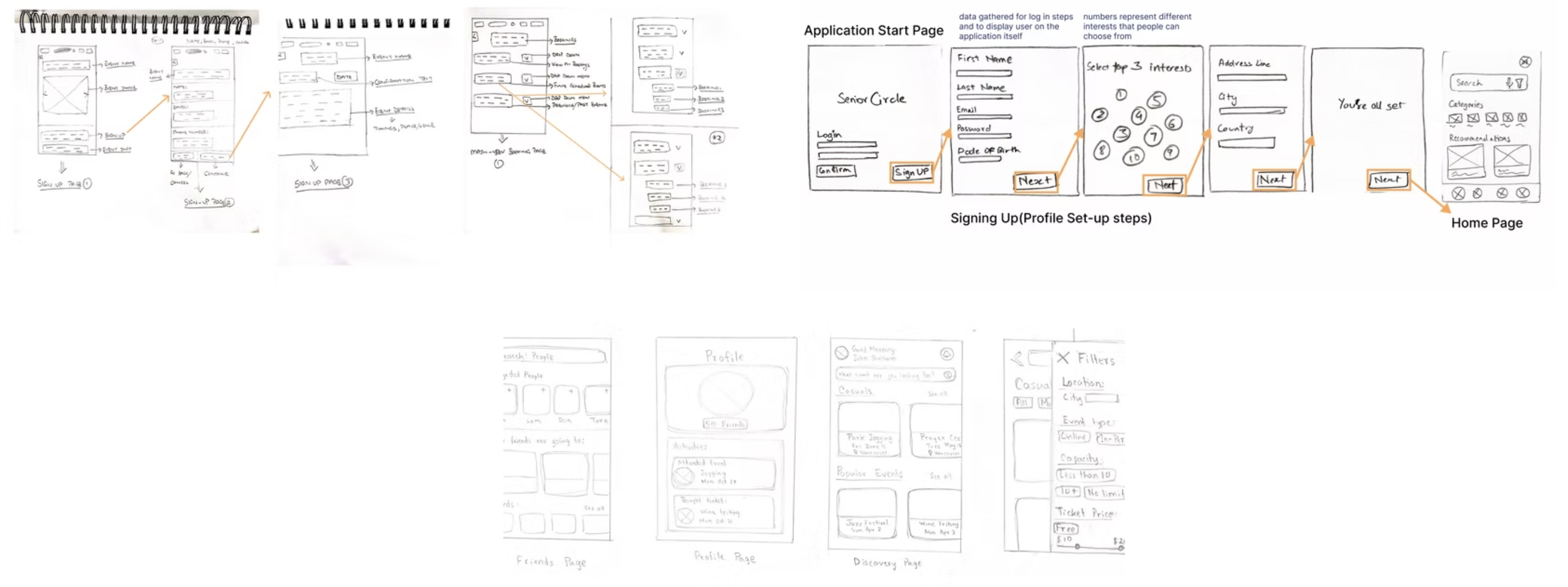
Flow sketches
Early wireframes focused on simplifying task steps and keeping navigation consistent.
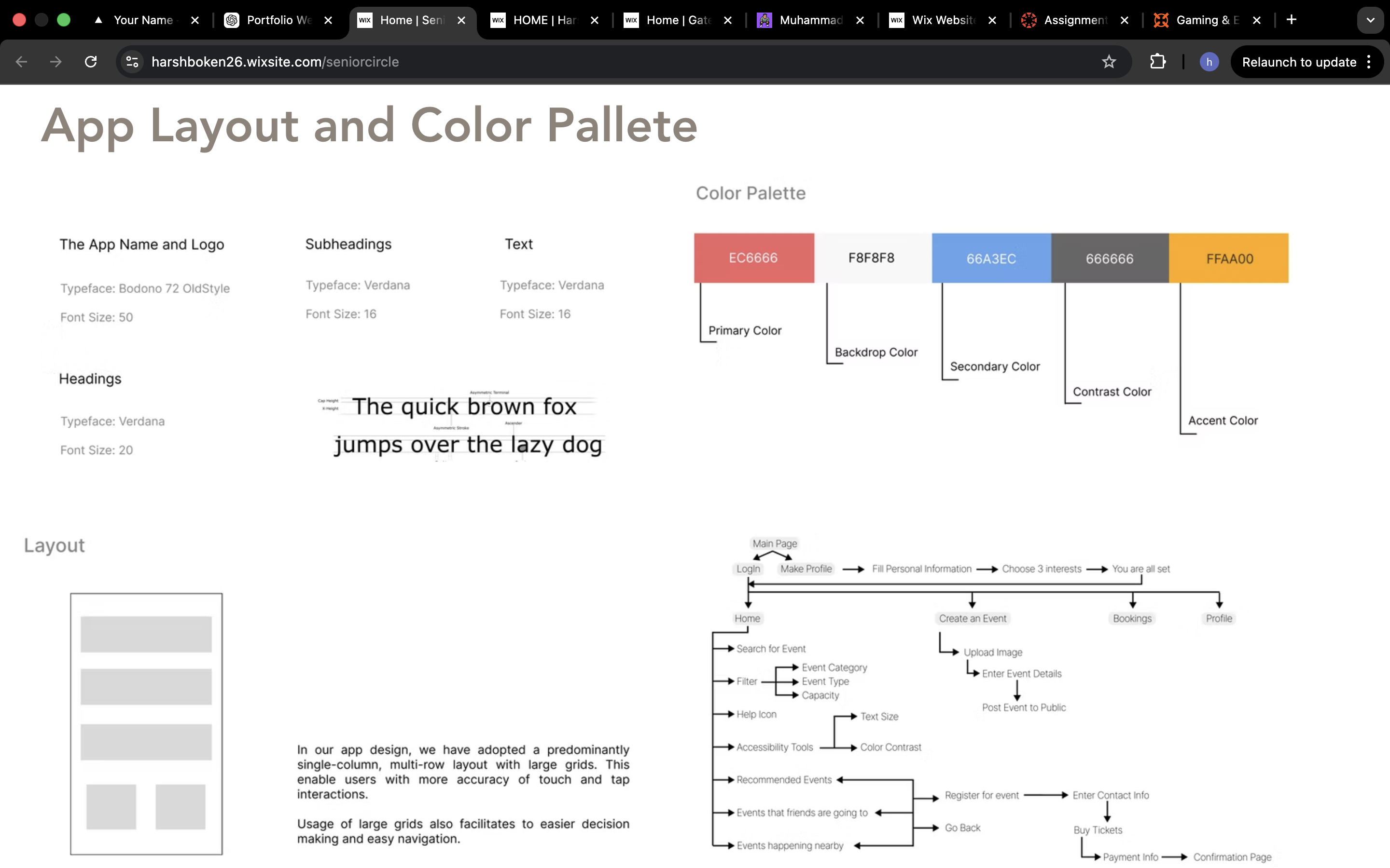
Layout strategy
SeniorCircle uses a single-column, multi-row layout with generous spacing and large tap targets to reduce motor strain and decision fatigue. The structure improves scanning, keeps tasks predictable, and reduces cognitive load for seniors.
- Large grids for accurate tap interaction
- Low text density + strong hierarchy
- Consistent placement of primary actions
Color palette + typography
The palette balances warmth, clarity, and contrast to support aging eyes. Typography stays clean and consistent with strong heading separation and readable base sizing.
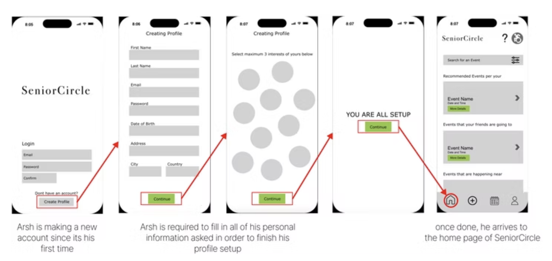
Onboarding & profile setup
Users create a profile to personalize recommendations. Interest selection informs event curation on the home page, with a max-3 constraint to reduce overload.
Event discovery
- Search by interest
- Filter by distance / location
- Sort by online / in-person
- Recommended events + events friends are attending
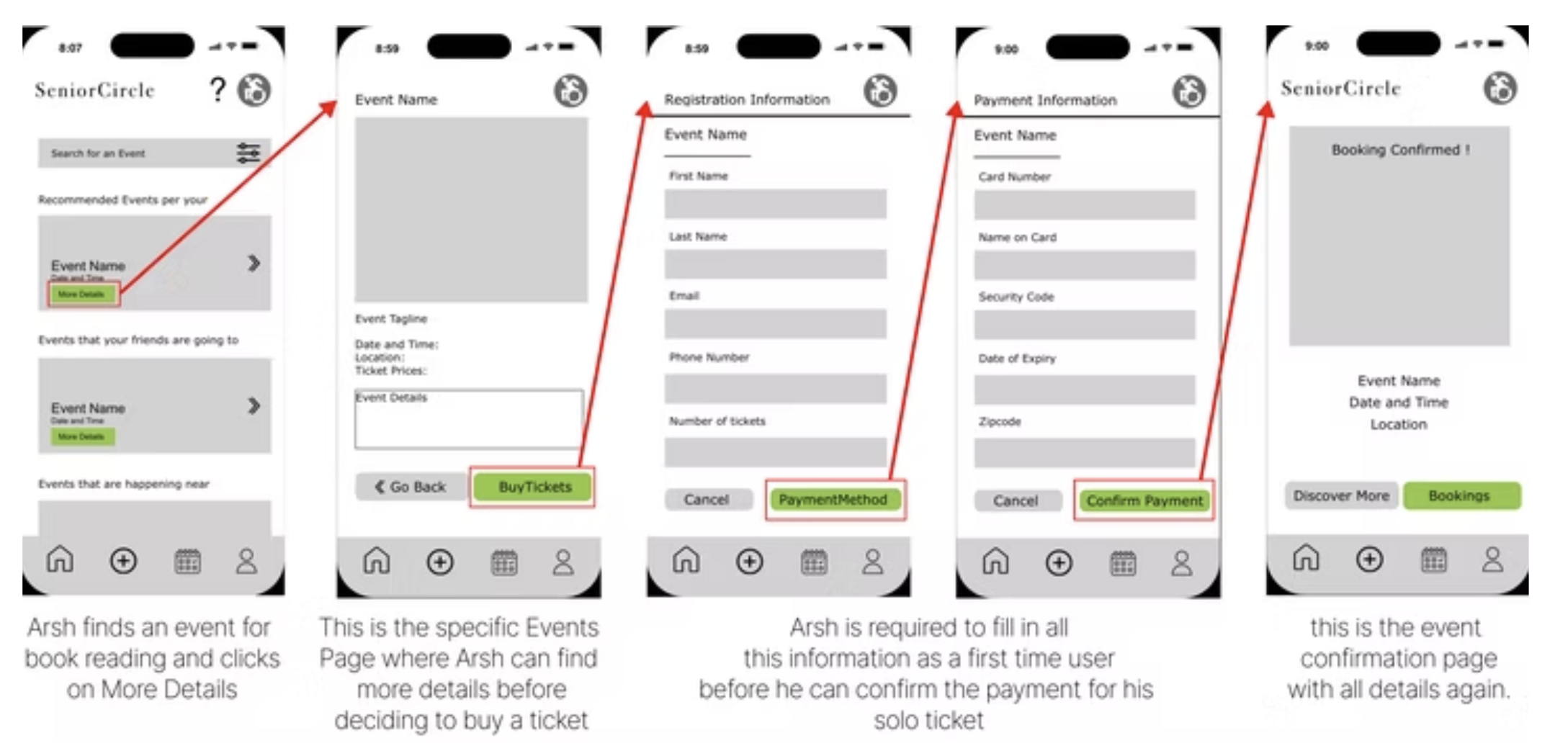
Bookings & payments
The booking flow is structured to be step-by-step and reassuring, with a confirmation screen that restates core details.
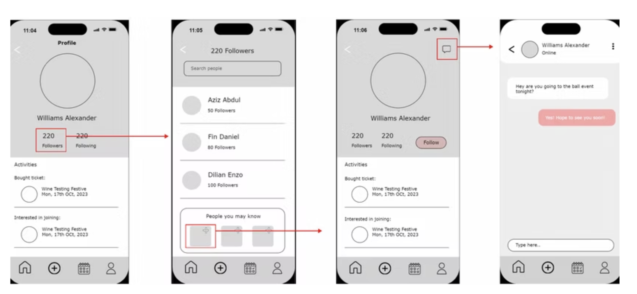
Community layer
Profiles, following, and messaging support social connection beyond ticketing—helping users build confidence before events and maintain community after.
Method
We used surveys and Think-Aloud usability testing with seniors to understand accessibility barriers, behavioral patterns, and expectations from an event platform. Data was analyzed to identify friction points affecting task completion, navigation clarity, and emotional confidence.
Tasks tested
- Sign up and create a profile
- Find an in-person art & wine event
- Book and purchase a ticket
- View past bookings
Evaluation questions
- Was the task easy or difficult? (0–5 rating)
- Were any steps confusing?
- Were features easy to locate?
- What felt most intuitive / least intuitive?
- What features would improve the experience?
Result
Testing validated the accessibility decisions and received positive feedback for clarity, simplicity, and relevance—showing how thoughtful interface design can improve digital independence for older adults.
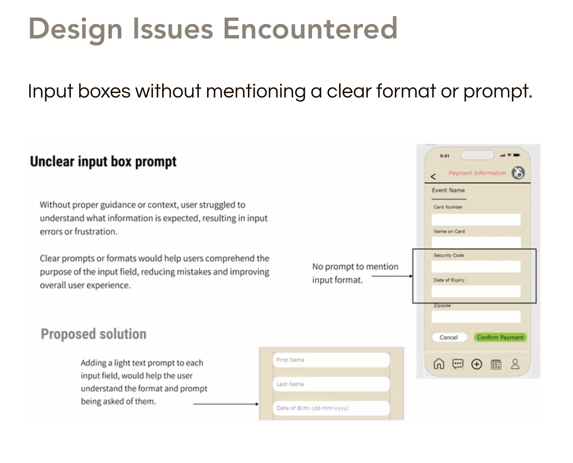
1) Unclear input prompts
Fields lacked format guidance (e.g., date formats / security code expectations), causing hesitation and errors. We introduced placeholder prompts and format hints to improve confidence.
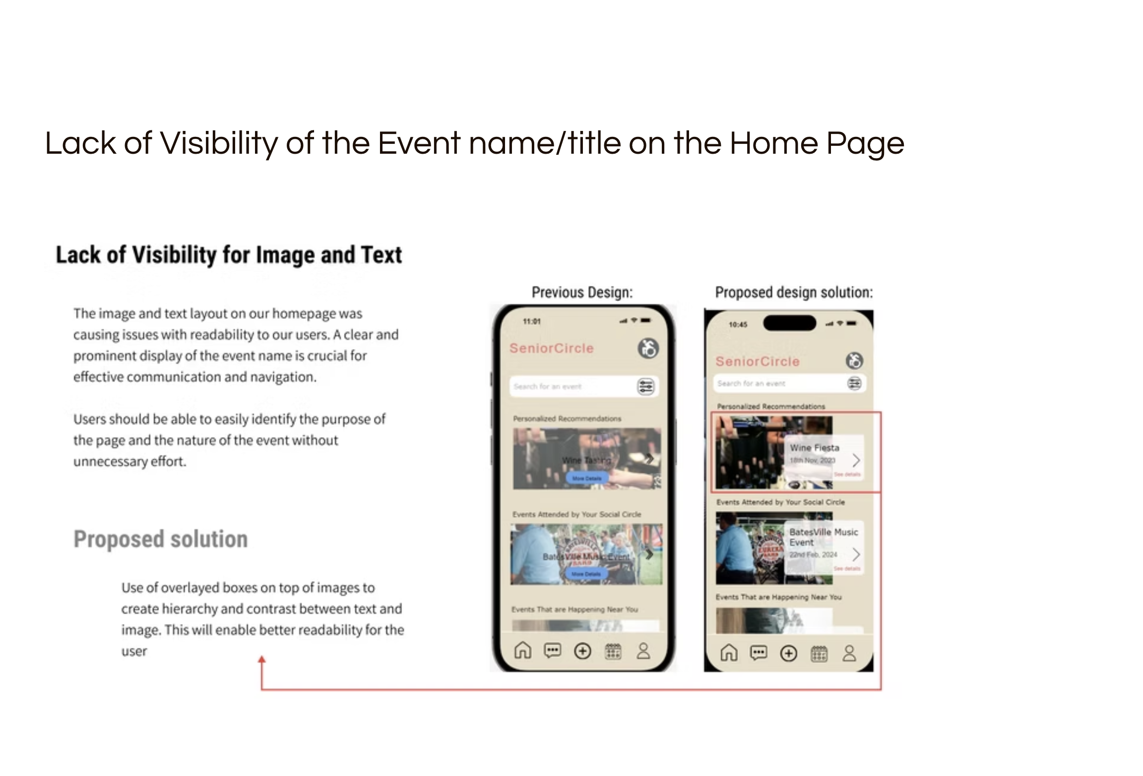
2) Low visibility of event title
Event titles competed with imagery on the home feed. We added overlay cards and strengthened hierarchy so users can scan event names instantly.
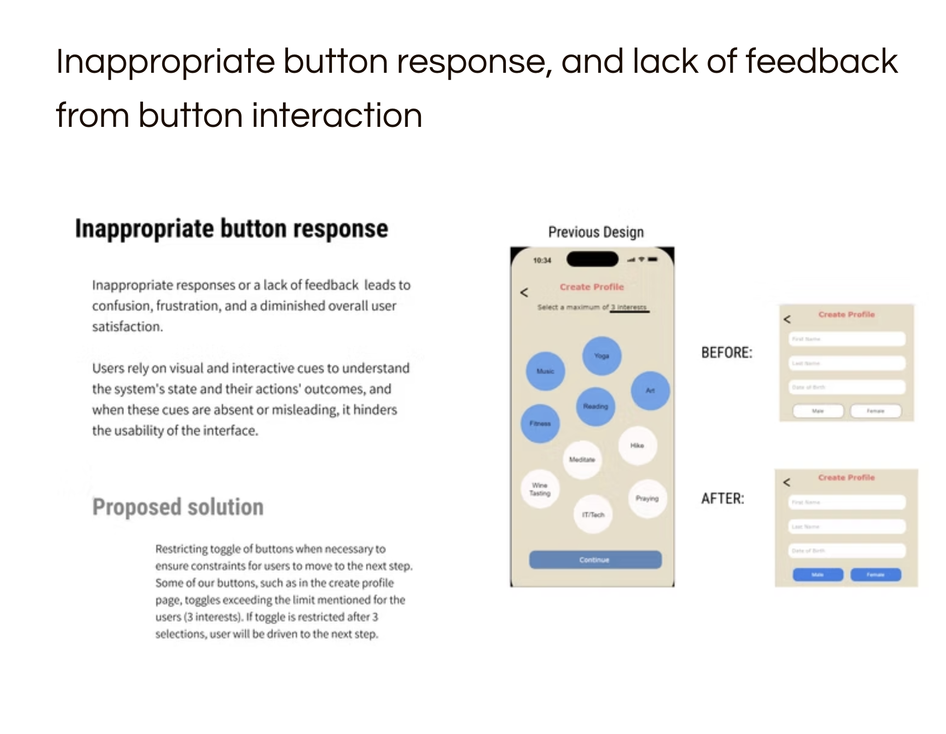
3) Missing feedback + weak constraints
Buttons lacked feedback states and interest selection could exceed limits. We improved selected states and constrained interests to a max of 3 with clearer continuation cues.
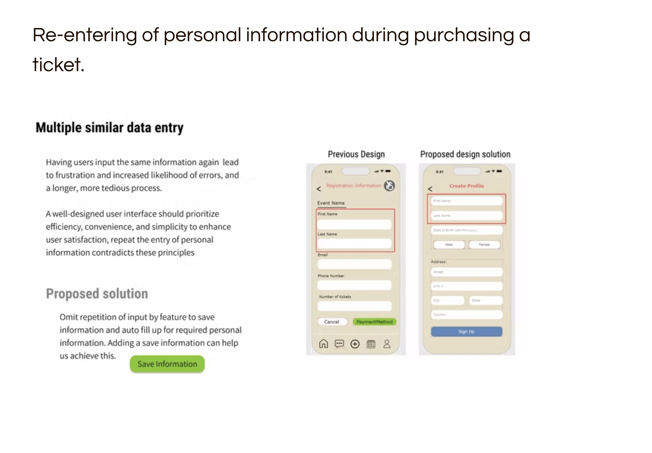
4) Re-entering personal info during checkout
Repeated data entry increased friction and errors. We proposed “Save information” + autofill to reduce redundancy and speed up ticket purchase.
Impact
- Clearer onboarding with fewer errors and less hesitation
- Faster event scanning through improved hierarchy
- More reliable interactions via feedback + constraints
- More efficient checkout through reduced repetition